First such signal in Bitcoin (BTC) history: Death Cross at 200W MA
This signal appears for the first time in the history of Bitcoin (BTC). The 20-week moving average (20W MA) has just crossed below the 200-week (200W MA). Although the BTC price has never experienced such a situation, perhaps the correlation with the traditional stock market (SPX) will give us some clues.
In this article, BeInCrypto takes a look at the first signal that is currently being generated on Bitcoin’s weekly chart. 20W MA has made an unconfirmed death cross with 200W MA. In traditional markets, this event is usually confirmation of a long-term bear market. However, it is the correlation with the S&P 500 (SPX) that can help us give this signal a more bullish interpretation.
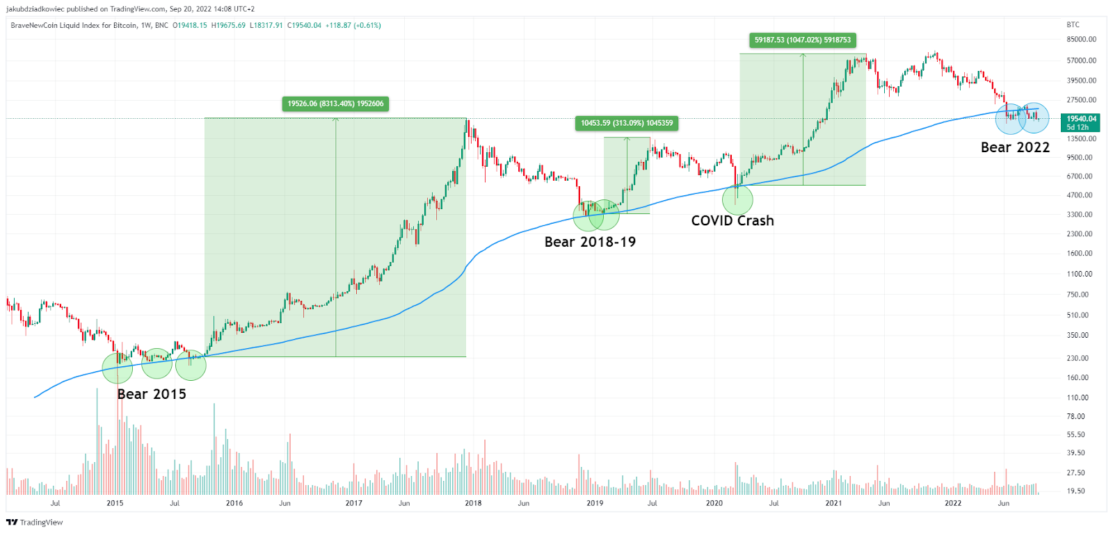
Buys around 200W MA
On the long-term logarithmic chart, we see that the BTC price has rarely reached the 200W MA area (blue line). This happened only a few times in history, during the process of generating the absolute bottom of previous bear markets (green circles). Also, historical declines usually did not cause weekly candles to close below the 200W MA, although there were some exceptions to this.
Therefore, until recently, the 200W MA level was believed to be a solid indicator of the BTC bottom and represented an excellent buying opportunity. The increases that came with this area in the past were impressive:
- 2015: up 8313% from last return to $230,
- 2019: up 313% from last return to $3351,
- 2020 COVID crash: up 1047% from the rebound to $5620.
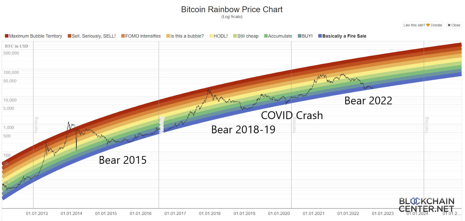
The narrative of reaching an absolute bottom near the 200W MA is supported by Bitcoin’s famous “rainbow chart”. It delineates the areas of logarithmic regression, color-coded according to the rainbow spectrum, best for buying, holding or selling.
During previous bear markets, BTC always reached the blue and purple areas with maximum selling and buying opportunities. It is no different now that BTC is in the last purple “fire sale” area since the June decline.
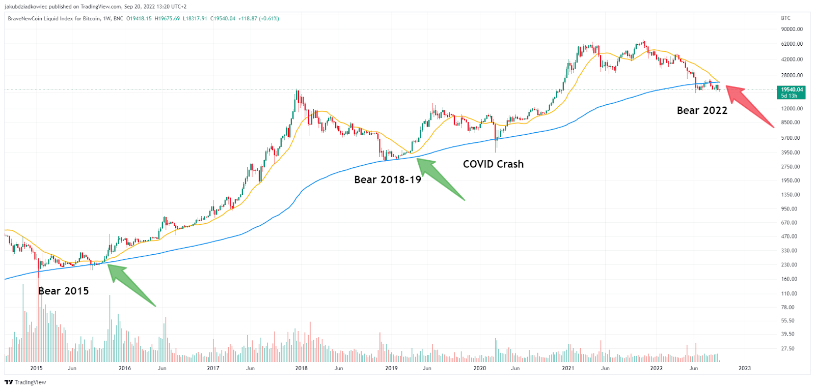
First cross in history
However, the current situation on the chart is a little different. Bitcoin has failed to hold the 200W MA level and has already closed more than 10 weekly candles below it (blue circles above). Also, the attempt to get back above this moving average in mid-August proved unsuccessful. That led to a retest and rejection, which is a bearish signal.
However, the most alarming signal, appearing for the first time ever, comes from the 20W MA. This medium-term moving average has crossed below the 200W MA (red arrow). The decline below is yet to be confirmed as the weekly candle has not yet closed. However, it seems inevitable this week or next week.
In the historical analysis, we see that neither in 2015 nor in 2019 has there been a dead end between 20W MA and 200W MA (green arrows). The only thing that can be seen is that after the maximum approach to these two lines, there was a significant increase in the price of BTC. This is of course due to the fact that both moving averages are lagging indicators, so they refer to past price action and do not predict the future.
200W MA and correlation with the S&P 500
Cryptocurrency Analyst @el_crypto_prof tweeted a chart of Bitcoin where he also pointed to the death cross of the 200W MA. However, on his chart, the 20W MA crosses the 200W MA for the second time in history. This is because he plotted the moving average of the relationship between the price of Bitcoin and the S&P 500 index.
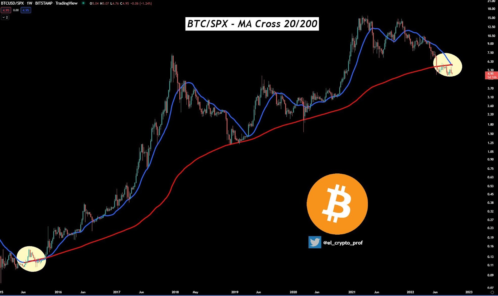
Commenting on the chart, he points out that the death cross happened back in 2015, and it happened after the absolute bottom had been reached. Moreover, he adds that “just a few months later, one of the biggest bullruns of $BTC started.”
The chart above not only provides further interpretation to the death cross we analyzed, but also shows the long-term dominance of BTC over the traditional stock market. The same aspect was pointed out today by the famous @100trillionUSD creator of the Stock-to-Flow model for Bitcoin.
In its tweet, PlanB admits that BTC’s correlation with the SPX is strong today, but the scale of historical increases is unmatched. According to his calculations, SPX rose 4x in the same period and BTC as much as 2000x, which he calls “completely different worlds.”
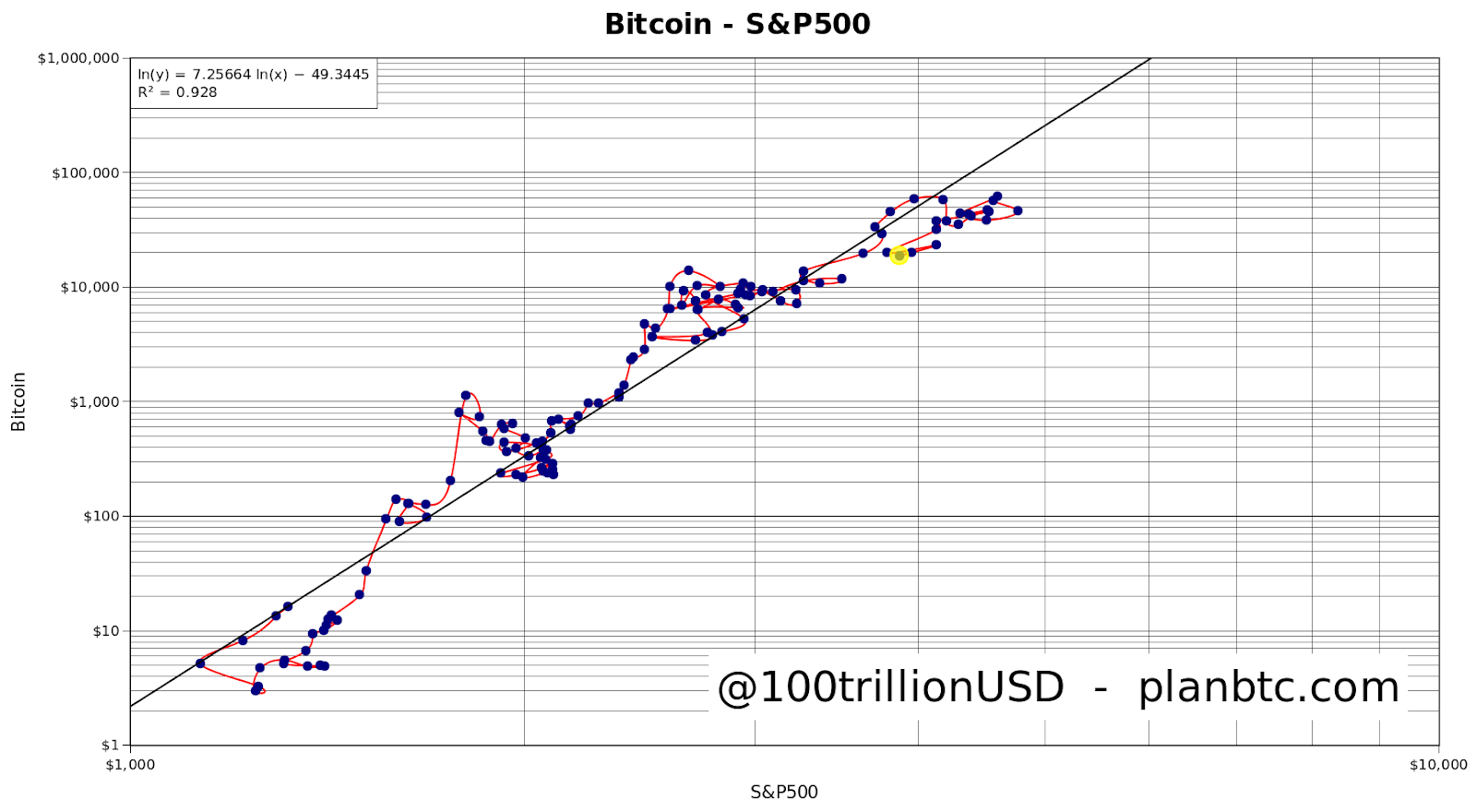
Of course, such a magnitude difference today is not to be expected, if only by much greater market value of the cryptocurrency sector and Bitcoin. However, the bottom line is that BTC is still a more favorable long-term investment than SPX, and the 200W MA area is an excellent place to jump into.
For Be[In]Crypto’s Latest Bitcoin (BTC) Analysis, click here.
Disclaimer
All information on our website is published in good faith and for general information purposes only. Any action the reader takes on the information contained on our website is strictly at their own risk.


