Understanding the “State of Crypto Index”

Summary: I’m talking about the mental game of investing, especially when it comes to crypto markets. Subscribe here and follow me for weekly updates.
Here is a tool that will give you new reasons to invest in crypto.
And it’s not based on price, it’s based on real users.
That’s the new State of Crypto Index, by renowned venture capital firm Andreessen Horowitz (aka “a16z”), which has invested billions in crypto startups since 2013.
Below I will explain how this tool works. But first, here’s why it’s so important to crypto investors.
The users are the “demand”
Crypto needs to be used to be useful.
You can measure price of bitcoin all day long but measures users of bitcoin is a much more valuable metric. (Hint: bitcoin users have stayed roughly the same since 2020.)
After all, crypto companies are meant to connect people, to help them act with new forms of value. If the price goes up but the number of users goes downit doesn’t say much about the utility.
(On the contrary, if the price goes down but the number of users goes upwhich can signal a good deal.)
It seems so obvious that we don’t need to say it: crypto must be used to be useful. But almost no one invests in this way. Everyone gets excited by price increases; rarely do people get excited about user growth.
User growth is one of our core investment principles: we measure it every Thursday in our Top 10 Fundamentals newsletter for Premium members. If long-term users grow, long-term pricing will usually grow like a weed.
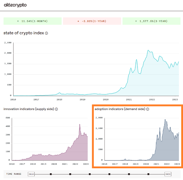
Measuring users with the state of crypto index
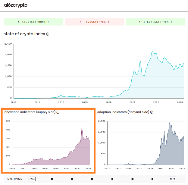
Like any index, the State of Crypto Index is meant to give us a high-level snapshot of the industry over time: is it growing or shrinking?
In a16z lingo, users are what they call “demand”. (The more crypto users, the greater the demand for crypto products.)
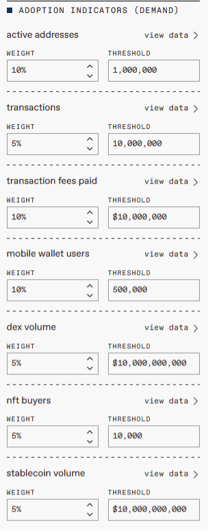
They roll up a bunch of user metrics into a simple chart at the bottom right:
To the right of the diagram you can see the calculations that go into this diagram (like ingredients that go into a recipe):
- Active addresses: number of unique users across top blockchains
- Transaction: number of unique transactions across top blockchains
- Transaction Fees: the amount people pay to use top blockchains (e.g. gas fees on Ethereum)
- Mobile wallet users: number of unique users on the top crypto mobile wallets
- DEX volume: value of tokens exchanged across top decentralized exchanges (e.g. Uniswap)
- NFT buyers: number of unique users buying NFTs
- Stablecoin volume: The value of stablecoins transferred across top blockchains
What I love about this index is that you can change the weighting of the ingredients to adjust the recipe. For example, I would weight active addresses much more heavily, while I would weight transaction fees less (because they depend on price):
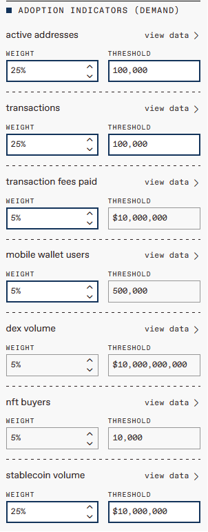
Produce a diagram that looks more like this:
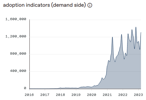
The important thing is not the weighting, but the general shape of the chart as you play with the weightings. Is it still going in the direction of growth? In that case, the industry is very likely to grow.
But the index does more than measure user growth across the industry. It also measures developer growth.
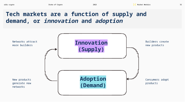
Developers are “Supply”
If users provide the demand for crypto products, developers provide the supply. (With price that attracts both.)
Take bitcoin: as more people started buying it, its price increased, which made more developers interested in building crypto tokens and projects. This led to higher prices, more users and so on. Virtuous circle.
Of course, this never happens in a linear fashion, but in waves. Take this excellent slide showing when well-known tech companies started versus the overall stock market:
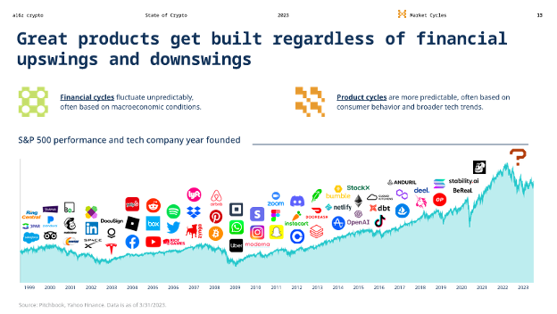
The long-term trajectory is upward growth, with many of today’s most powerful companies started during market downturns.
The question mark on the far right of the slide means, What world-changing crypto company is being built right now?
Developers and users. Supply and demand. It’s like the old chicken and the egg question: which came first?
As investors, it doesn’t matter, as long as we measure both.
Measuring developers with the State of Crypto Index
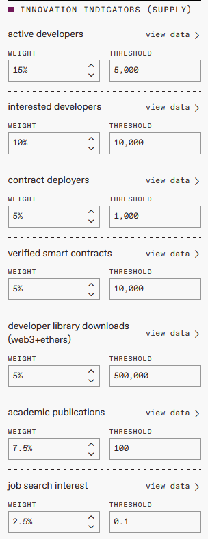
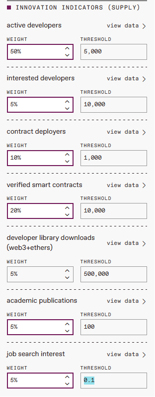
To measure developers (or the supply side), the ingredients are:
- Active developers: number of developers building crypto projects (e.g. through Github)
- Interested developers: number of developers playing with it
- Contract distributors: Number of developers deploying new code on public blockchains
- Verified smart contracts: Number of new applications launched
- Downloading the developer library: Number of app downloads to help developers
- Academic publications: Number of published research articles on crypto topics
- Job search interest: Number of searches for blockchain and crypto-related jobs
Just as I see active users as the primary metric for crypto adoption, active developers is the primary metric for crypto development. So my recipe will put much more emphasis on active developers, something like this:
Creating a diagram that still resembles the standards given by a16z:
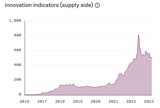
With my improved recipe, the overall index looks even better than the a16z’s outlook:
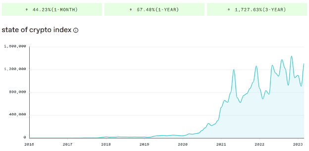
It is a picture of astonishing long-term growth. As a point of reference, if you invested $1 that grew to $1,727 in three years, you would be considered an investment genius. That’s what it’s been like to invest in this general industry.
And the long-term results have been even better.
(However, be careful with the ups and downs of the crypto market roller coaster. Our Blockchain Believers portfolio will keep you well diversified.)
Why not just measure the price?
No matter how you adjust this index, chances are you’ll still end up with something very similar to the price of the crypto market. Or to put it even more crudely, a chart that looks like the price of bitcoin:
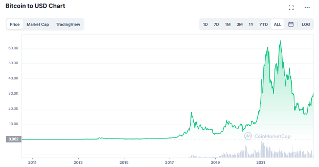
Again, the price can be misleading. That’s one data point, and it’s driven by fear and greed. This index is a powerful tool because it contains many data points that show the growth of the underlying infrastructure – both supply and demand.
Investor Takeaway: Apply this to individual tokens
As investors, we are looking for the hidden gems, the undervalued crypto tokens. We can use the same methodology to drill into individual crypto projects, to look at their aggregate demand (users) and supply (developers).
To do this, we have a great guide on how to read crypto financial statements. Using tracking reports from Token Terminal, we show you how to find both active developers and active users (supply and demand) for all the leading crypto tokens.
Think of a16z’s State of Crypto Index as rolling all this information into one useful chart, to show us how the industry is growing as a whole.
Remember: there is never a straight shot. That’s not how growth happens. Instead, it’s a rolling series of ups and downs, gradually leading us to more users, more developers, and more long-term wealth.
Investing in the long-term future is what we are here to do. Now, with the State of Crypto Index, we have a new way to measure our progress.


