How to Read Bitcoin Charts

You may have come across terms thrown around in the crypto space, such as “head and shoulders,” “rising wedges,” and “cup and handle.” These are used by traders when analyzing crypto chart patterns. In this guide, we’ll explain how to read bitcoin charts and highlight popular crypto chart patterns you should know.
What is chart analysis?
To decide whether to take a long or short position when trading bitcoin, you can use charts that give you timely insight. Technical analysis can help traders assess price trends and crypto chart patterns to spot trading opportunities.
Technical analysis involves the analysis of past trading activity and price fluctuations of an asset, which can help predict future price movements to some extent. Technical analysis uses patterns in price information to identify trends and make predictions.
Bitcoin chart analysis is important in the sense that traders can interpret charts to better understand the herd mentality. Bullish and bearish trends are part of a general market symphony of rising and falling prices.
In other words, a steady increase in the price of a digital asset is often an indicator of optimism and excitement in the market. The opposite is also true. A crypto asset with a downward trajectory reflects a gloomy market outlook and puts pressure on sellers.
Both bullish and bearish trends can only be reversed if there is a change in the attitude of the market participants.
That said, bitcoin chart analysis relies on mathematical and statistical modeling to understand price and market behavior. Three main principles apply to bitcoin charting principles:
- History repeats itself
- Prismomentum is a trend
- The market gives a discount on everything
Using these principles, you can easily draw on multiple influences, including behavioral and traditional economic principles, to predict market movements.
Remember that technical analysis not only focuses on price movements, but provides clues about market sentiment. To use the crypto map analysis method, you need to take into account factors such as historical trends in crypto demand, global regulatory trends, and recent trends in the crypto community.
How to read crypto charts
Reading crypto charts is essential for anyone looking to trade digital assets. If you want to assess price trends from a crypto chart, you need to learn about the different types of charts. There are three common types of charts used by traders; line chart, bar chart and candlestick chart.
Line chart
A line chart or graph chart is a visual representation of a digital asset’s price history using a single, continuous line. A line chart displays data as a series of data points connected by straight line segments. A line chart is the most basic type of crypto chart and usually only plots the closing prices.
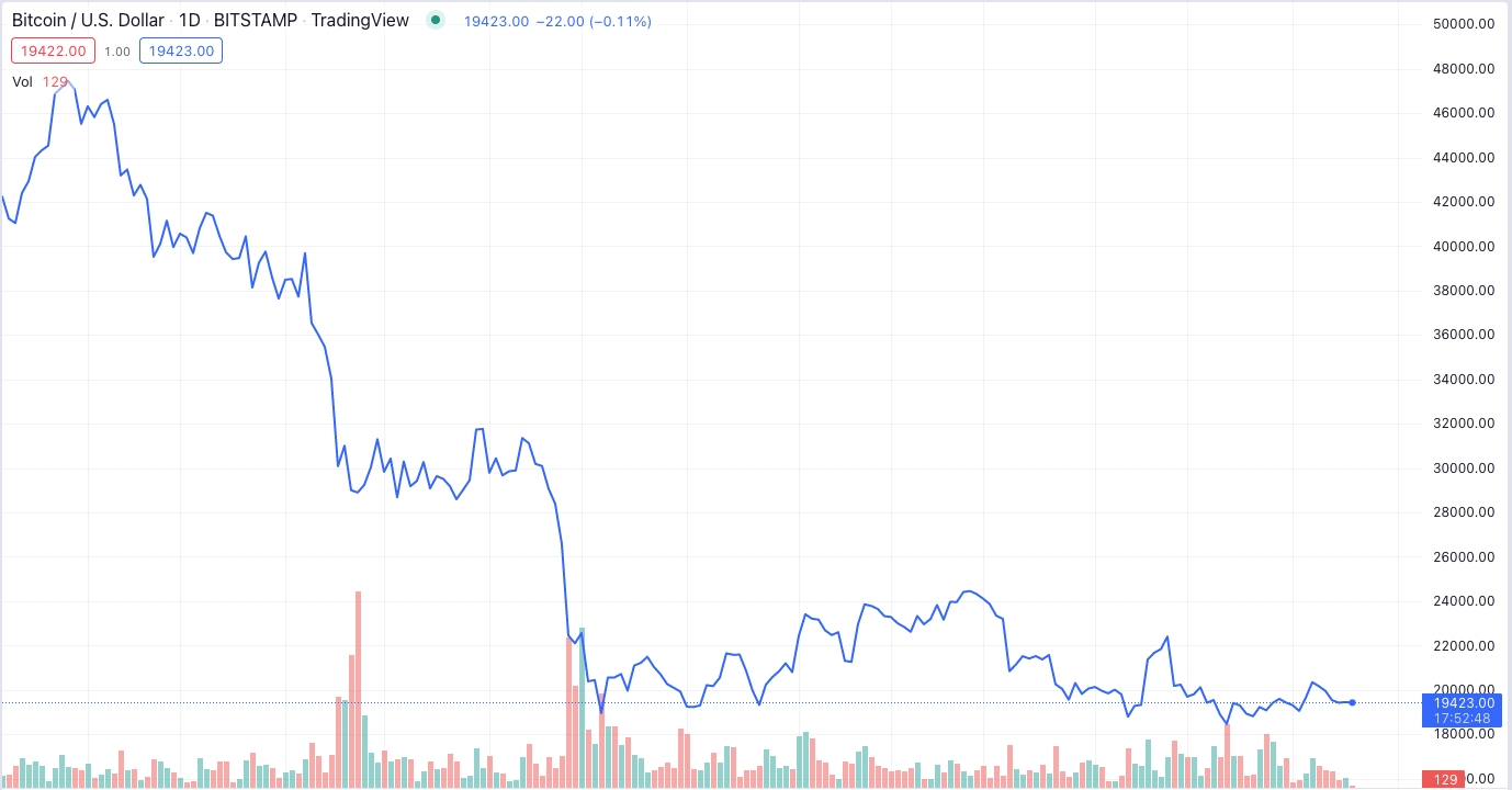
In the chart above, the horizontal axis is the time scale and the vertical axis indicates the price. You can calculate the crypto price by connecting a data point to the horizontal axis in a straight line and the date by connecting a data point to the vertical axis. Each point in the graph tracks the daily closing price.
Bar chart
A bar chart consists of several price bars, where each bar represents the price performance over a specific period. A bar chart visually shows the price swings of an asset over a specified time frame.
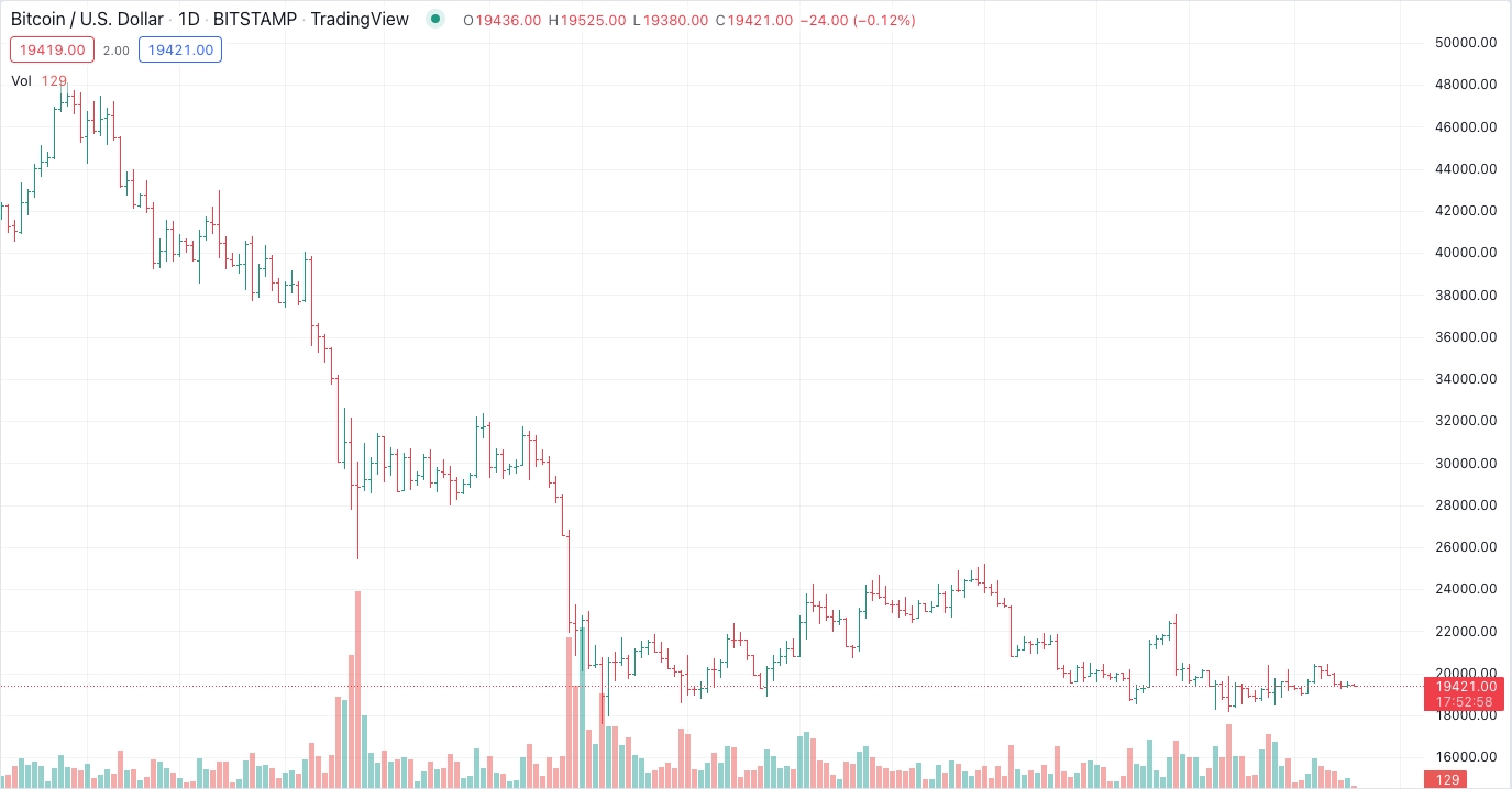
In the chart above, the vertical bar on the price line shows the high and low prices for that period. The horizontal lines on each side represent the open and close prices.
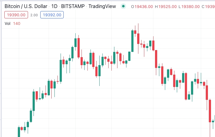
Candlestick charts
The most popular crypto chart out there is a candlestick chart. A candlestick chart uses candles to depict the up/down trend of crypto price within a specified time period.
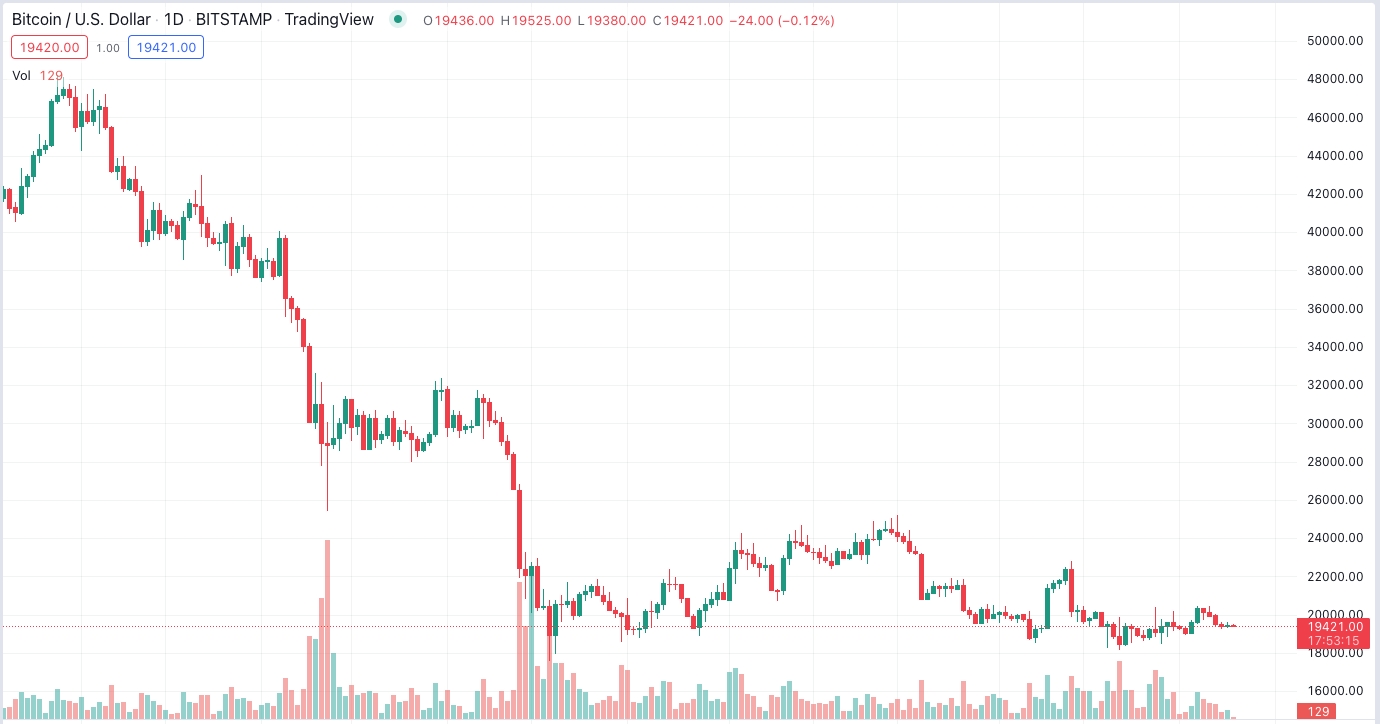
A candlestick consists of a body and a wick. The body of the candle represents the opening and closing prices, while the wick attached to the top represents the highest price of the crypto within that time frame. The week at the bottom represents the lowest price of the crypto asset within the selected time frame.
The colors of the light are important. The red light shows that the price of an asset has fallen, while the green light shows that the price of an asset has risen.
Popular Crypto Chart Patterns You Should Know About
Crypto charts form different patterns that traders can use to take a position based on their significance. A chart pattern is a shape in a price chart that can indicate the next price movements based on historical trends. Crypto chart patterns are the basis of technical analysis and can help traders predict price trends.
Crypto chart patterns can be classified into the following groups:
- Continuation patterns provide continuation signals about the current trend.
- Bilateral patterns indicates high volatility and uncertainty in the market.
- Reversal patterns give reversal signals.
Here are five popular crypto trading patterns that you can trade.
Head and shoulders
This is an advanced chart pattern that is bullish and bearish, with a large peak in the middle and smaller peaks on either side. It is characterized by a temporary high and low, followed by a major correction higher or lower, and follows the third move higher or lower which is similar to the first move.
Triple and double top and bottom
A double (or triple) top and bottom chart occurs when markets bounce off the same resistance or support level twice (or three times) in a row. A bullish indicator is considered a double bottom, while a bearish trading signal is known as a double top. Both triple and double patterns usually indicate that market sentiment has changed and prices are about to change direction.
Ascending and descending triangle
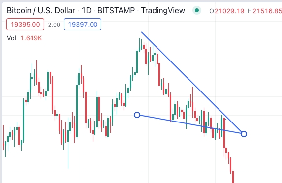
Ascending and descending triangles are created with a horizontal trendline connecting highs and lows and a second trendline connecting ascending highs and descending lows. The resulting triangle will reach a decision point where price will break out or crash from the horizontal line in the direction of the sloping line.
Cup and handle
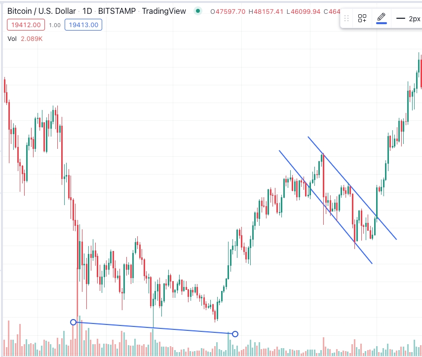
A cup and handle is a bullish reversal pattern that mirrors a cup, with the cup resembling a rounded bottom chart and the handle resembling a wedge pattern. The right side of the pattern indicates a low trading volume that can last for a 7-65 week time frame.
Wedges
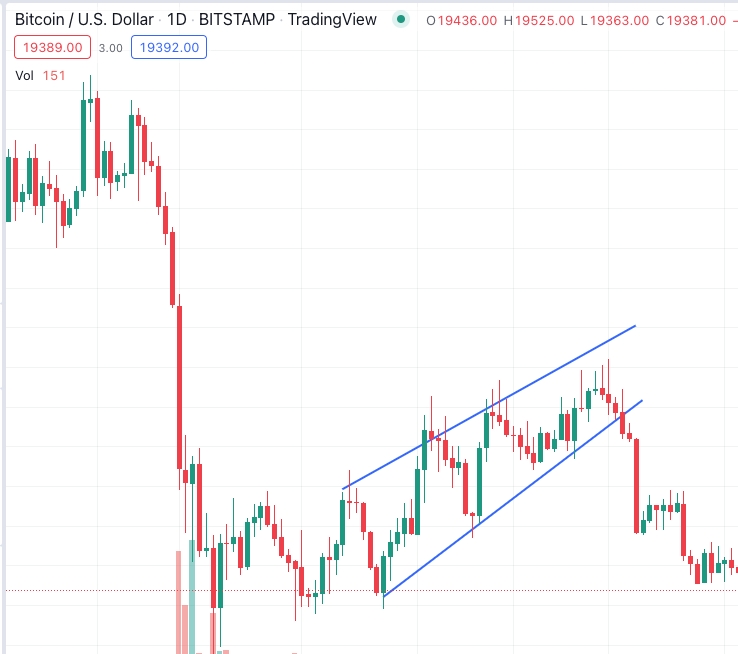
Wedges are bullish and bearish reversal patterns that occur when trend lines converge. A rising wedge is a bearish signal, while a falling wedge is a bullish signal.