A quick guide on the Bitcoin Rainbow Chart
Bitcoin Rainbow chart is a simple indicator that can help investors and traders time the market better. It is one of the oldest and easiest ways to determine BTC’s future price estimates, which uses past performance and statistical tools to provide insight into long-term price movements.
Cryptocurrencies are known to be highly volatile. The prices of these digital assets can rise or fall sharply in days, hours or even minutes. Therefore, any tools that can help market participants make better informed trades and investments are more than welcome.
One such tool is the Bitcoin Rainbow chart. It is a simple indicator that can help investors and traders time the market better. But what exactly is this chart and how does it work? Join us to find out.
What is the Bitcoin Rainbow Chart?
The Bitcoin Rainbow chart is one of the oldest and easiest ways to determine BTC’s future price estimates. It uses past performance and statistical tools to provide insight into long-term price movements.
The Rainbow chart is the brainchild of an early Bitcoin investor who goes by the name Azop on Reddit. He developed the chart in 2014 as a “fun way to look at long-term price movements, without taking into account the daily volatility noise.”
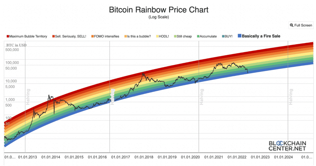
The chart gets its name from the rainbow-inspired bands of color it uses to indicate market sentiment around BTC in different price ranges. This color-coded market sentiment indicator can help investors time their market entry and exit.
In short, the rainbow chart is a superimposed visualization of Bitcoin’s historical price pattern on a logarithmic graph. It helps predict Bitcoin’s long-term price moment without factoring in daily volatility.
The lower bands from indigo to light green all indicate that BTC is undervalued. These are all excellent opportunities to buy into the market as prices are most likely to shoot up from these bands. The middle yellow line is a neutral indicator – one should not buy or sell, just hold instead.
If it moves into the orange band, it means that BTC is starting to build momentum. However, one should find out if this momentum is a true breakout or just a bubble. All of the following dark bands indicate that BTC is overvalued and indicate an excellent time to sell.
How Accurate is the Bitcoin Rainbow Chart?
Since it is based on historical data and uses statistical tools, the Rainbow Chart is considered quite accurate. If you analyze a BTC Rainbow chart, you will notice that prices usually drop after touching the top red band. They also tend to increase after bending to the lowest indigo bar.
For example, in May 2021, BTC had fallen into the indigo zone. However, a few months later, in November 2021, BTC reached the penultimate red band, reaching its all-time high of $69,000. From there, BTC began to climb down and is currently re-entering the indigo zone. This indicates that Bitcoin is currently undervalued and an upward move should be just around the corner.
Conclusion
The Bitcoin Rainbow chart is an easy-to-understand and relatively accurate indicator of Bitcoin’s long-term price movements. It can indicate the right time to buy or sell in the crypto market. However, cryptoassets are highly volatile and you should not make investments based on just a single indicator. Instead, you should do your own thorough research and invest only as much as you can afford to lose completely.
(Edited by : Anushka Sharma)


