‘Not just a fintech brand’: a new identity for Apron escapes category norms
Apron, a fintech product that quickly sorts, pays and reconciles invoices, launched its rebranding initiative by encouraging binge-watching. Zosia Swidlicka, the founder of Opening Line, shared one of the first points of the brief that Apron founder Bogdan Uzbekov gave to her team and partner agency, Outsiders: watch The Bear.
The TV series, which swept through the pop culture high ground last year, follows a good chef who desperately tries to wade through the brutal realities of running a small business while constantly fighting fires. “This tells you everything you need to know about what our customers go through on a daily basis,” Uzbekov told Swidlicka and her team.
It was a smart, direct way to immerse the designers and strategists at Outsiders and Opening Line, who would collaborate on the new identity in the world of Apron. Swidlicka told Creative Boom, “The passion, grit and energy of the show came through in spades during the interviews we held with Apron team members and core customers. It was clear that they all shared the same hustler mentality; riding on momentum and driven to succeed.” Except when they encountered obstacles to progress—like spending five hours a week paying bills instead of working toward the bigger picture.”
Credit: Opening Line / Outsiders / Apron

Credit: Opening Line / Outsiders / Apron
As The Bear went into overdrive and interviews were completed, Opening Line and Outsiders began reimagining Apron’s identity in a way that captured the pervasive grit and hustler mentality to cut through the busy payment solutions category. “With a crowded market, competitive category and growing skepticism about new technology, we had a lot to contend with in this project,” said Swidlicka. “As great as the product is… we knew it wouldn’t catch on without a distinctive brand behind it. We needed to tell a story.”
Swidlicka explained: “It would have been very easy to create a positioning around saving business owners and accountants time and money – ‘payments are painful’ and all that – in fact, that’s what everyone else in the market was already doing. We knew that in order to get through to this audience; we must aim not for their rational brains, but their emotional ones.”
The resulting positioning avoids becoming just another credit-heavy fintech solution because of the seamless and deep collaboration that connects the visual and the verbal. The rebrand was created in just ten weeks, which contributes to the impressive transformation.

Credit: Opening Line / Outsiders / Apron

Credit: Opening Line / Outsiders / Apron
Credit: Opening Line / Outsiders / Apron
Outsiders oversaw the visual identity, and the verbal identity was created by Opening Line. Yet, in reality, the teams worked hand in hand throughout the process, collaborating at key stages to ensure maximum cohesion and crossover across all elements. “Working in this way meant that the ‘joyful efficient’ persona we had established together at the beginning was able to really come into its own across all touchpoints,” Swidlicka said.
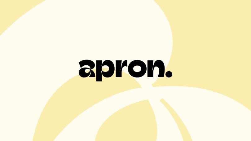
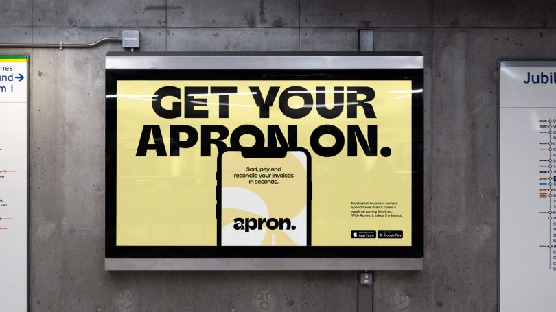
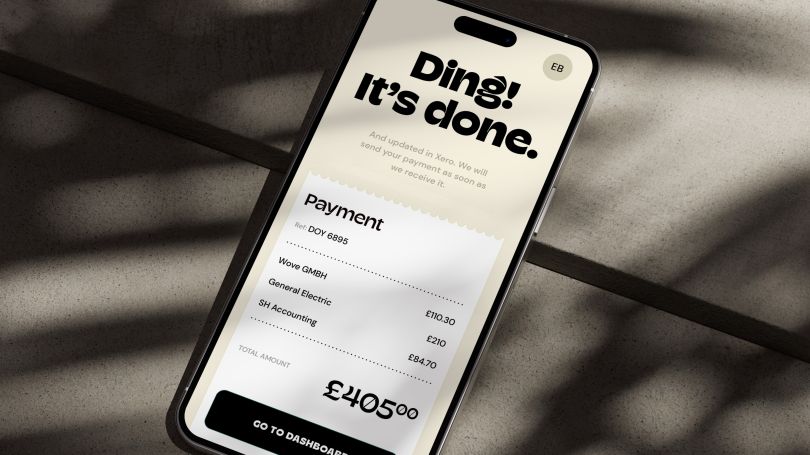
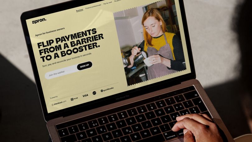
The identity brings tangibility back to the process of cash transfer between partners, grounding Apron in the real world through subtle graphic devices such as the jagged receipt border.
Meanwhile, the tone of voice takes a “show, don’t tell” approach that helps the audience visualize their lives with (and without) the apron. Using bold, simple typography balances assertiveness with a friendliness that feels punchy but not alienating. The palette is bare-bones and joyous, grounded in reality to represent the roll-up-your-sleeves mentality of Apron’s already overexcited audience.
Credit: Opening Line / Outsiders / Apron
Credit: Opening Line / Outsiders / Apron
Credit: Opening Line / Outsiders / Apron
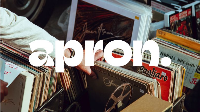
Swidlicka continued, “the cherry on top is the logo.” Inspired by the brand name, the “a” represents the knot as you put on an apron and get ready to go to work. “It’s our little montage moment: put on your apron and get going.”
Overall, the brand evokes action and momentum by communicating the value of what Apron can help people achieve. Swidlicka summed up the transformation: “We turned payments from a pain to a positive, a barrier to a booster, by painting a picture of how they can be leveraged to unlock bigger gains. It significantly differentiates the brand from competitors and brings a new narrative to stable fintech messaging.” Apron, says Swidlicka, has been elevated to a “critical cog in the small business machine. Not just one of a million other fintech solutions.”
The new Apron identity and positioning is now live across the company’s websites and social media profiles, with much more to come.


