Bitcoin (BTC) gets a third ever bullish signal from these two moving averages
For the third time in history, two key moving averages made a bearish cross on the Bitcoin (BTC) chart. Paradoxically, this can be a very bullish signal! Historically, this has led to large increases and initiated an accumulation phase before the next bull market.
Long-term moving averages like to stay away from each other. However, from time to time they intersect, often defining turning points on an asset’s chart. On Bitcoin’s chart, the 50-week and 100-week moving averages (50W MA and 100W MA) serve such a function.
In today’s analysis, we will look at their historical intersections, which provided interesting long-term signals for the BTC price. This is because it turns out that a bearish cross was a signal to reach a bottom in historical bear markets. A bullish cross, on the other hand, gave reason to start a new bull market.
In conjunction with these two moving averages is the so-called Coral Trend Indicator. This indicator also signals that the bottom of the current bear market has already been reached and Bitcoin is currently undergoing an accumulation phase before the next bull market.
50W MA crosses 100W MA
On August 5, an important technical event occurred on the BTC chart. Two important moving averages made a bearish cross. 50W MA fell below 100W MA. This was the third such situation in the entire history of BTC trading (green lines).
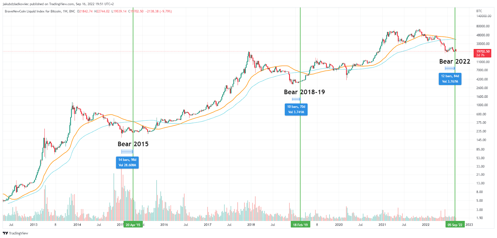
Previously, this signal appeared twice: on April 20, 2015 and on February 18, 2019. In both cases, the crossing occurred a dozen weeks after Bitcoin reached the absolute bottom of the bear market. The same applies this time:
- 2015: 14 weeks / 98 days from the bottom to $164
- 2019: 10 weeks / 70 days from the bottom to $3,148
- 2022: 12 weeks / 84 days from the bottom to $17,607
Thus, it turns out that the crossing that took place on September 5 is located perfectly in the middle of the time period set by the two previous historical signals. Of course, two historical signals are far too few to be statistically valid. However, one can certainly talk about some similarities.
Bitcoin at $41,100 on August 14, 2023
If you look further at this signal, you can trace what happened next. The next major event was a bullish cross when the 50W MA rebounded above the 100W MA. This has happened twice so far: 16 May 2016 and 9 December 2019 (red lines).
After the week in which the bearish cross occurred, the BTC price went through a phase of accumulation and increase. From 2015-2016 it increased by 111% in this period, while in 2019 it increased by 104%. Meanwhile, the time between the two signals was 56 and 42 weeks respectively.
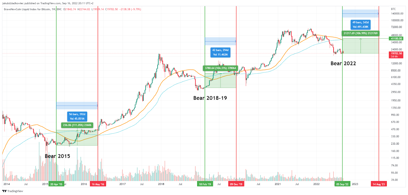
Now, if we want to extrapolate this sparse data to the current chart, we can attempt to calculate the price of BTC and the time it will reach the next bullish cross. Average historical data on the upside we get 107.5%, and on time we get 49 weeks.
This gives us a very rough prediction of the BTC price of $41,100, which will be reached on August 14, 2023. Also, a bullish cross between the 50W MA and the 100W MA in the long term led to gains.
However, it is worth noting that in March 2020, due to the COVID-19 crash, the BTC price fell below the values recorded during the previous signal. In contrast, in 2016 the signal initiated a year and a half bull market and the BTC price did not fall below the price from the signal.
Confluence with Coral Trend Indicator
Further confirmation of the conclusions from the above analysis is provided by the so-called Coral Trend Indicator. The update was posted yesterday on Twitter by cryptocurrency analyst @el_crypto_prof.
The indicator is a simple curve on the monthly chart of Bitcoin, which has two possible colors. Green corresponds to a curve with an uphill slope, while red corresponds to a downhill slope. Thus, it is a typical lagging indicator, similar to the moving averages analyzed earlier.

The analyst points out that the first red dot on the Coral Trend Indicator chart appeared approximately 60 days after reaching the absolute bottom of the bear market (blue arrows). This happened both in 2015 and at the turn of the year 2018-2019.
For now, the indicator also delivered its first red dot in early August, also after about 60 days from the June low of $17,607. Although historically the indicator has continued to generate a few more red dots, Bitcoin has already bounced north, preparing for the next bull market.
For Be[in]Crypto’s Latest Bitcoin (BTC) Analysis, click here.
Disclaimer
All information on our website is published in good faith and for general information purposes only. Any action the reader takes on the information contained on our website is strictly at their own risk.


